How to decorate your home with Summer Sunrise inspired interiors
Picture it - you wake up refreshed, energised, peaceful. The summer sun is rising, bathing your space in a pink-hued glow. It’s a day full of promise - no looming tasks or responsibilities, just the freedom to enjoy a warm, hazy summer day, your way. That’s the Summer Sunrise mood - and with our design tips, you can evoke that feeling in your space, year-round.
“This might be a summer-inspired trend, but it’s one that feels fresh in every season. Pastels consistently trend every spring, and bold shapes create that cosiness we all need in autumn - and the warm woods and soft colour palette make the perfect backdrop for your festive decor, too.” - Alessandra Cahill, Trends Content Writer
How to create the Summer Sunrise look
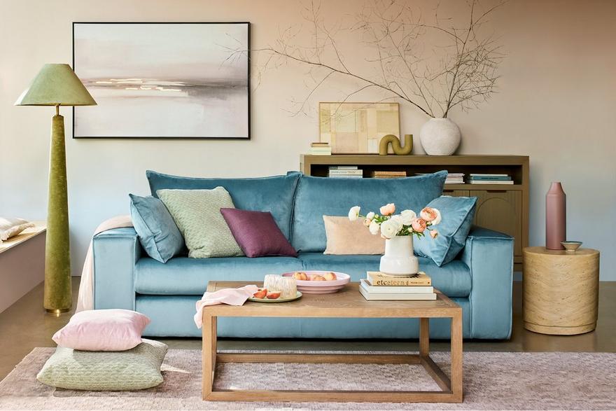
Nodding to the sun’s soft rays at sunrise, this look captures the mood of a relaxed LA bolthole nestled in the hills. Nailing it is all about balancing impact and softness.
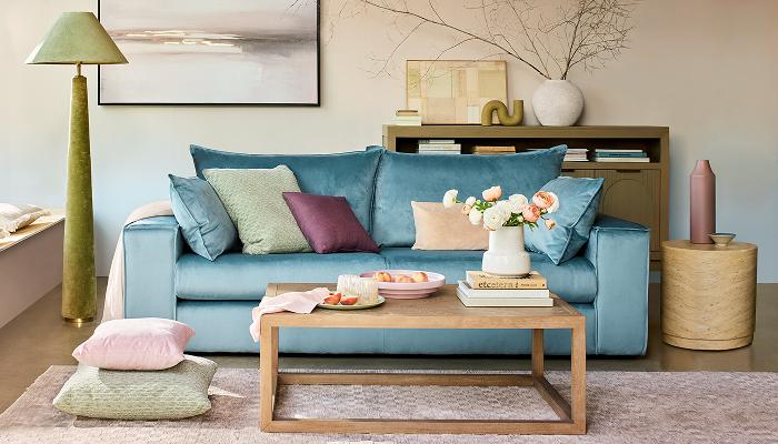
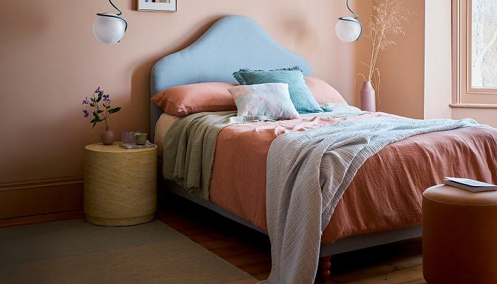
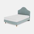
Choose bold, strong furniture shapes, upholstered or painted in soft pastels, to evoke the mellow yet energising glow of a summer morning. Grounding accent tones keep this look grown-up: think olive green and sand accessories, whether floor lamps or consoles, blended with natural, untreated wood for a desert-luxe feel. Bold pops of contrasting pastels, such as a sky-blue bed head against oyster pink walls, keeps the space feeling fresh and breezy.
“The interest in this look comes from the unusual combinations of different elements. We don’t often see bold shapes in soft pastel tones at the centre of a look - it’s a playful mixing of masculine and feminine, traditional and contemporary.” - Kellie Wyles, Head of Buying and Brands

Key elements
A pared-back, minimalist look at its heart, Summer Sunrise does leave room for playfulness - whether it’s choosing a colour palette of your favourite pastels, or combining contrasting silhouettes to make clever visual impact.

Modern pastels
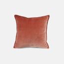
To achieve the soft glow of early morning golden hour, choose brown-based pastels such as plaster pink or faded coral. These complement other shades beautifully, including grown-up olive green, timeless sky blue, or classic sandy beige.

Contrasting shapes
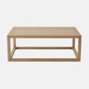
Mix it up when it comes to furniture shaping – think dramatic sphere pendants against a scalloped headboard, or round side tables blended with a low, angular coffee table. This is a great look if you have eclectic furniture taste!

Minimal texture
With a lot of bold silhouettes and contrasting colours, it can be easy to overwork this look. Keep wall finishes to flat colours, and stick to colour blocking two or three pastel tones, rather than opting for patterns or prints.
Key pieces
The perfect opportunity to opt for both a bold silhouettes AND bold colours, this trend appeals to maximalists who still want to cultivate a calm, zen feel for their interior design.

Bold upholstery
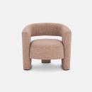
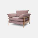
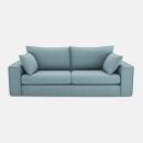
The softer colour palette of this trend can carry both a striking silhouette and unusual colour. Embrace graphic lines - like our Lovise four-seater sofa in sky blue velvet - and pair with pieces featuring striking curves, like our Essie accent chair.

Natural wood and stone furniture
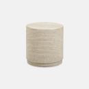
Classic, natural materials make the perfect accent pieces for this pastel-focussed look. Opt for natural, untreated woods - think pale birch, maple or pine - or faux travertine, like our Eos side table, for a desert-luxe feel.

Sculptural accessories
Look for unusually shaped accessories, which add visual interest without fussy details. Chunky floor lamps, unexpected silhouettes, and large floral arrangements or trailing plants tie the look together in a curated, thoughtful way.
Explore more trends

Garden Party inspired interiors
Looking for some fresh interiors inspiration? Our Garden Party trend is here to bring the outside, in. Celebrating an easy connection between inside and out - thanks to a blend of fresh neutrals, zingy greens and elegant florals.

Rustic Industrial Interiors
Pared-back style, raw textures, and uncomplicated comfort make this design trend a timeless choice, taking the natural warmth of a rustic interior and elevating it with the oh-so contemporary chic of an urban industrial space.

Retro Standard
If your idea of the ultimate luxurious living room is straight out of a Wes Anderson film with the saturation dialled to 100, this trend is right up your alley.
